We are proud to announce the launch of our new logo. This is the result of a huge project spanning almost a year, with the aim of bringing our branding up to date whilst keeping our hand firmly on our heritage and company tradition.
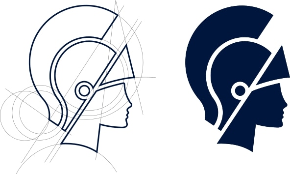
Our changes represent an evolution rather than a complete rebrand. Our red, white, and blue colour scheme remains as does the Britannia lady, marking us out as a proudly British company. Britannia is the face of our group, and symbolises strength, precision and efficiency – features which have always been central to the way we do business.
However, we also wanted our logo to better represent our friendliness and care towards our team members and customers, so we have also incorporated softer elements such as the rounded edges on our new font.
Our overriding focus has been on simplification. This was necessary in order to create branding that worked as well online as on the side of a truck. For that reason, we focused on Britannia’s head rather than the whole figure. Our design team reworked the geometry of the existing logo to create strong forms that are straightforward and clearly legible across all platforms.
As well as communicating our status as national, international and commercial moving professionals, the new logo also works effectively with our local offices’ identities. It flexes with ease to accommodate branch names of hugely varying lengths, and demonstrates that at our core, we are still a group comprising family-run local moving companies.
The rollout of our new look has now begun in earnest, and we are working hard to bring all our uniforms, packing materials, signage, stationery and online resources up to speed. Vehicles are starting to appear in our new livery, but this part of the update will take a little longer to complete due to the size of our fleet. However, this was always conceived as a gradual transition. Sustainability is important to us, and so we would prefer to use old stock wherever possible rather than allowing our brand update to be responsible for tonnes of materials going to waste.
Our new look has been embraced with enthusiasm by the Britannia group and our network of commercial partners. We hope that our customers will be reassured that we’re the same people, still aiming to deliver a caring, friendly and efficient service at all times, just with a new visual identity. Our team are excited to be heading into the future as one of the most recognised brands in the moving industry, and we hope you like it too.